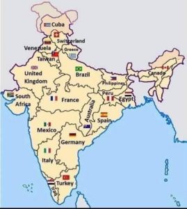
An Interesting map of India
This is an interesting map of India.
It compares the population of various countries with that of the states of India (marginal variation not to be considered)
and has replaced the state’s name with that of the country’s name.
It is wonderful to see that India contains so many countries….!!!!
This map was designed by a BNP Paribas analyst, for his New York office,
to give them an idea as to how difficult it is to manage India with its size and complexities.
It’s like managing all these different countries, together.